Can you imagine compacting The Hit List into a brief interaction of just a few seconds long? Certainly, you can imagine how the Apple Watch would be used in shorter bursts than iPads or iPhones.
But in bringing you The Hit List for Apple Watch, our design process really had to involve careful consideration — of what you want on your wrist, which gestures get you there fastest, which functions you want, and what you want in a Glance.
Clearly, to us, moving everything over to the smaller device was simply not the answer. We wanted to take advantage of its location on your wrist, to provide timely information that can be viewed at a glance and interacted with easily. We wanted to create a unique experience designed for the wrist.
Once we really understood that the Apple Watch is about immediacy, about “now” and about “today,” we centered the design around the Today list.
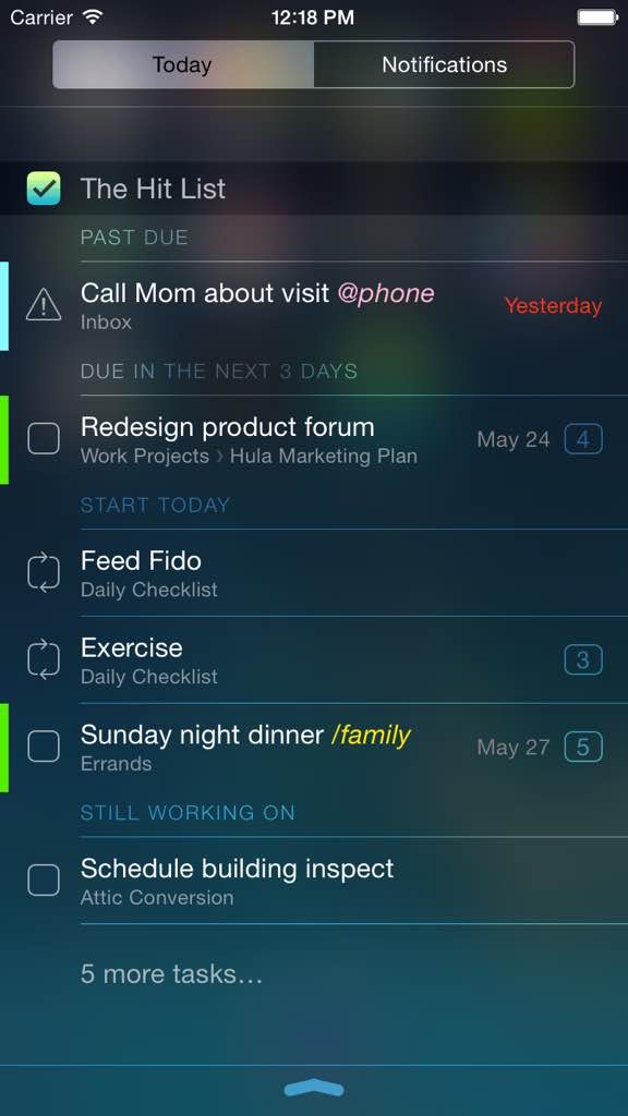
Using The Hit List on an Apple Watch requires pairing an Apple Watch with an iPhone. They go together. So, today, we released The Hit List for iPhone version 2.3 that introduces a Today widget for Notifications Center, in addition to The Hit List for Apple Watch, which provides timely information about your Today list, viewed at a glance.

Not only does the Today approach eliminate extra taps, but the simplicity is more elegant and immediately useful. The Hit List glance provides an overview from your own Today list about how much you’ve done and how much is left to do.
When you open The Hit List on Apple Watch, you’re immediately presented with the Today list. Tap on a task for applicable actions and details.
A press lets you add a task using dictation. When you tap “done,” the task is added and syncs with your iPhone and your Mac immediately.
What was our biggest challenge? The iPhone app, the Apple Watch app and the Today widget all read and write to the same place, so keeping it coordinated along with The Hit List Sync Service meant re-engineering quite a bit of our underlying code.
The technical challenges led to a decision to resist pushing something out the door before we had a chance to actually test on an actual shipping devices. This proved to be a smart decision.
So, while many other companies just ported everything and released the day the device shipped, we took a different approach. Every decision founded on the quick-burst customer experience. We approached the design differently, and carefully. We took time to test on real devices. We paid extra attention so you could get the most out of the quick burst of your attention.
We think investing this extra effort and time produced a higher quality app for the Apple Watch. As always, The Hit List strikes the perfect balance of app power and ease of use. We’re pretty excited about it and proud to bring The Hit List for Apple Watch and The Hit List for iPhone 2.3 update to you today.
